The Power Spectrum Average in emWave Pro is a graph that breaks down your heart rhythm into its different frequency components. Think of it as a “visualizer” for your Autonomic Nervous System (ANS).
The Power Spectrum Average represents a mathematical transformation (Fast Fourier Transform) of your heart rhythm data into its frequency components. It is an advanced tool for those interested in the biological mechanics behind Heart Rate Variability (HRV).
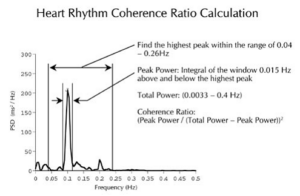
1. How to Read the Graph
The graph features two axes:
-
Horizontal Axis (X): Represents frequency in Hertz (Hz), or cycles per second.
-
Vertical Axis (Y): Represents Amplitude, or the power of those specific frequencies.
A common rhythm, like a 10-second breath cycle (5 seconds in, 5 seconds out), completes 1/10th of a cycle per second. This appears on the graph at the 0.1 Hz position.
2. The Three Frequency Regions
The background of the graph is divided into three color-coded regions, each reflecting different activity in your Autonomic Nervous System:
| Region | Name | Meaning |
| Left (Dark) | VLF (Very Low Frequency) | Primarily reflects Sympathetic (fight or flight) activation. Most people show a large peak here when stressed. |
| Center (Light) | LF (Low Frequency) | The “Baroreceptor Region.” In coherence, this shows a synchronization of the Sympathetic and Parasympathetic branches. |
| Right (Colored) | HF (High Frequency) | Reflects Parasympathetic (rest and digest) activity. A peak here often indicates a state of relaxation. |
3. The Coherence “Spike”
When you shift into a state of coherence, the complex “noise” of various biological influences quiets down. Your heart and breath synchronize into a single rhythm. On the graph, this results in the surrounding bars disappearing and one dominant, bell-shaped peak forming around the 0.1 Hz frequency. The taller this peak, the more “power” is concentrated in your coherent state.